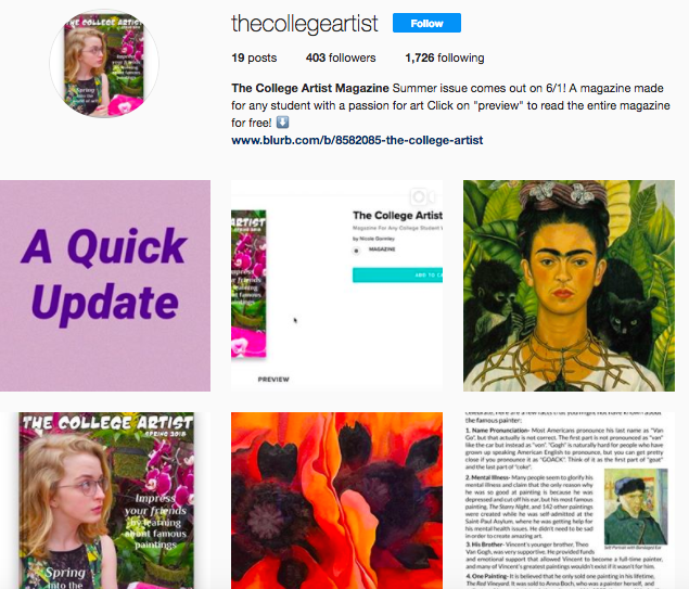
The College Artist Fall 2018 issue is out now!
My Thoughts on This Issue:
The Cover: I think that as a whole the contents of this issue are definitely a big step up in quality from the first two, but I’m not sure how I feel about the cover. I created the contents of the magazine this time around before I thought of the cover, and it left me trying to come up with a cover that matched the contents. Most of the pages had to do with school, Halloween, or coffee-related art. I think that the cover does a good job including all of those ideas, but something just seems off about it. I don’t know if it’s the quality of the drawing of the cups or the color palette or what, but something makes it seem dull or unappealing to me. It is what it is I guess.
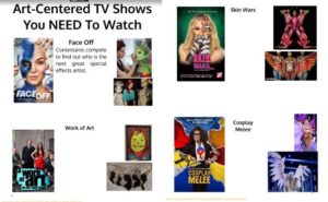
The Inside: As I previously stated, I think that the inside contents of this issue definitely look better in quality than the past two:
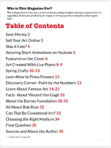
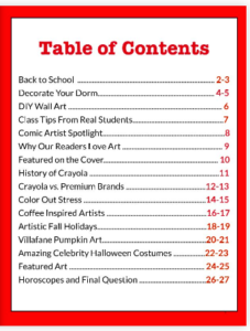
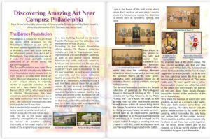
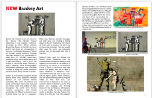
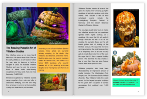
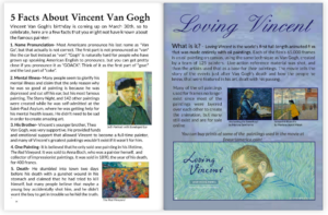
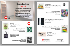
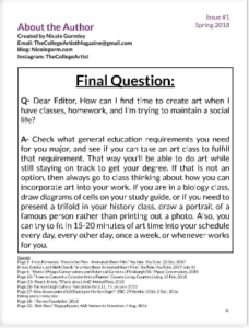
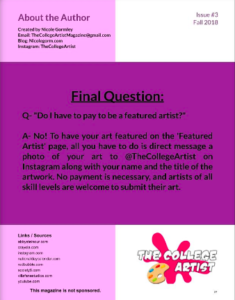
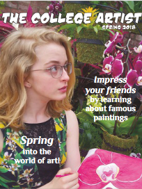
Overall I think that there has been an improvement in aesthetic and page design. I don’t think it quite looks professional yet, but I’m going to try to make each issue better than the one before it. This issue was shorter than I would have liked it to be. It was only 28 pages. For comparison, the Spring 2018 issue was 36 pages. I spent a lot more time than I anticipated playing around with design elements, and I ended up just running out of time to add more content. I’m going to try to make sure that I give myself enough time for the Winter 2018 issue to have at least 32 pages.


